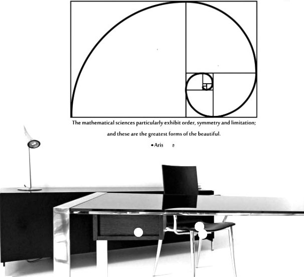
Mathematics is a subject not easily associated with interior design, especially once the bothersome, formidable entrance exams, where maths is a prerequisite subject, are over. But once you start looking closely, math is all about ratio and proportion and what is architecture and design if not that? Rational spacing, precision, the right ratio of length, breadth and height of a space- all contributes in creating the perfect scale and perception.
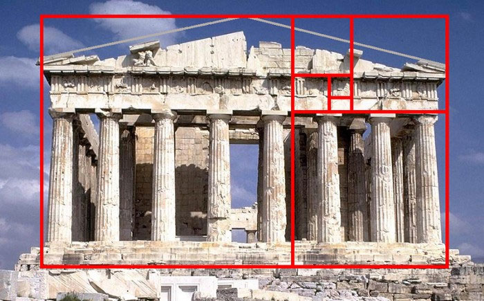 (Image Source: https://medium.com/@social_archi/does-the-golden-ratio-exist-in-architecture-c15a1b3edfba)
As architects, we have all heard of the Golden ratio and how artists and architects from time immemorial have been using it in design. From Stonehenge to the Egyptian pyramids, this ratio is visible. In the Parthenon in Greece, it was believed that the succession of rectangles had a length proportional to the golden ratio and was used as a means to measure its facade. Although later it was found that it was another ratio (one of 4:9) that appears throughout, the overall effect nevertheless was harmonious and pleasing. This ratio was used to determine dimensional relationships between the width and height of a building, the size of the portico and even the placement of the columns supporting the structure. Then there is the Great Mosque of Kairouan in Tunisia and the world’s largest Buddhist temple, Borobudur in Indonesia that are both designed according to the Golden ratio. Even Leonardo DaVinci and Michelangelo have made use of the ratio in their art. In the modernist period, Le Corbusier developed his own scale of proportions called the ‘Modulor’ which was based on the golden ratio, and is evident is his designs involving rectangular structures.
Simply put, it is a concept used to create aesthetically pleasing proportions in art, architecture and design. It helps to determine the size, proportion and placement of one element in context to the other.
The mathematics of the golden ratio is very closely linked to the Fibonacci sequence.
Knowledge of the Fibonacci sequence was expressed as early as Pingala (c. 450 BC–200 BC), in the Natya Shastra (c. 100 BC–c. 350 AD) by Bharata Muni and in the work of Virahanka (c. 700 AD). However it was an Italian mathematician Fibonacci, from Pisa who popularised the Hindu-Arabic numeral system and also introduced Europe to the Fibonacci sequence.
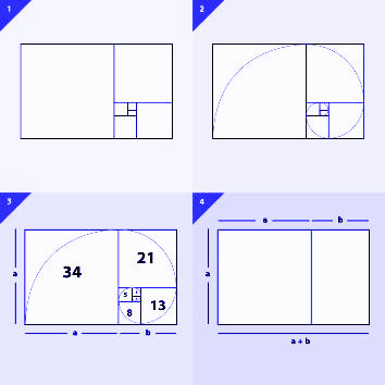
In the Fibonacci sequence, each number is the sum of the previous two numbers. Fibonacci omitted the "0" which is included today and reads as 0, 1, 1, 2, 3, 5, 8, 13, 21, 34, 55, 89, 144, and so on. There is another magical element to the correlation between the numbers - as soon as one goes beyond the number 8, and divides the smaller number into its larger neighbour, the result is 1.618.
This is commonly known as the Divine Proportion, or the Golden Mean.
This fascinating aspect of this sequence is that it is not just seen in Maths but is evident in nature, music, art and architecture as well!
 (Image Source: https://i.4pcdn.org/x/1532305979520.png)
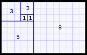
Take a square of say 1×1 – and multiply one side by 1.618 to get a rectangle with the size 1×1.618. Leaving aside the original 1×1 square on the rectangle, a smaller rectangle is left. Go on dividing the rectangles by more squares until the entire rectangle (with the dimension 1×1.618) consists of a series of squares getting smaller. Now if we draw a curve starting from the smallest square from one end to the opposite one and connect it to the neighbouring square ,we can create a long spiral.
Since the length of the spiral continually increases based on the sum of the past two numbers, this follows the Fibonacci Sequence.
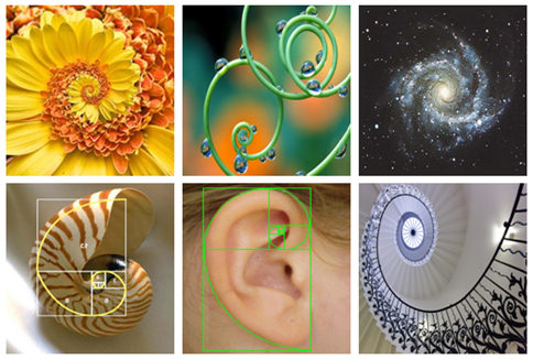
In nature, this progressive spiral can be seen in a snail shell, a galaxy , a hurricane, a pine cone and even in a seed. The way we react to beauty in nature is quite closely linked to how we perceive proportions and the relationship between smaller and larger forms. When these proportions are translated to architecture and design, the outcome to the reception of this design is naturally positive and wondrous.
Fibonacci references can be seen in design, right from the most obvious design element of the spiral staircase, to the unassuming chaise longue. Yes! Even this hybrid of a couch and chair with a curved body is a derivative of the F sequence.
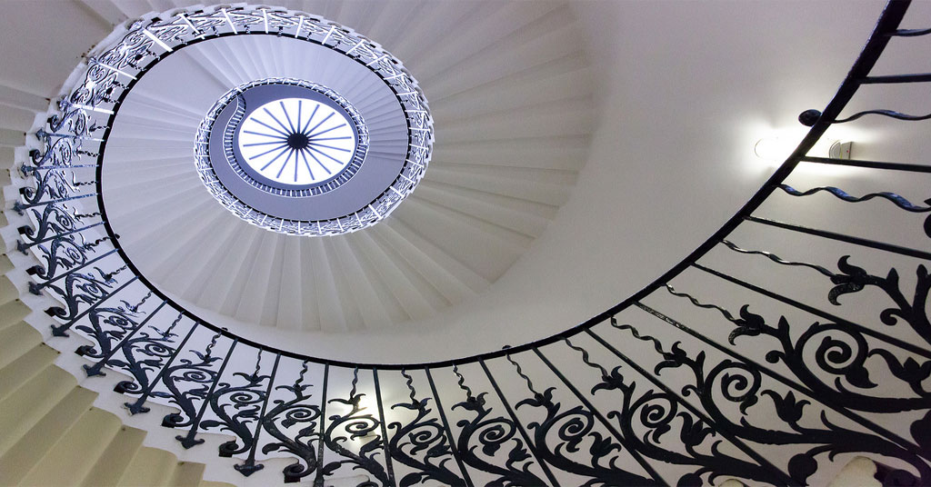 (Image Source: http://khachilife.com/climb-design-history-iconic-staircases/)
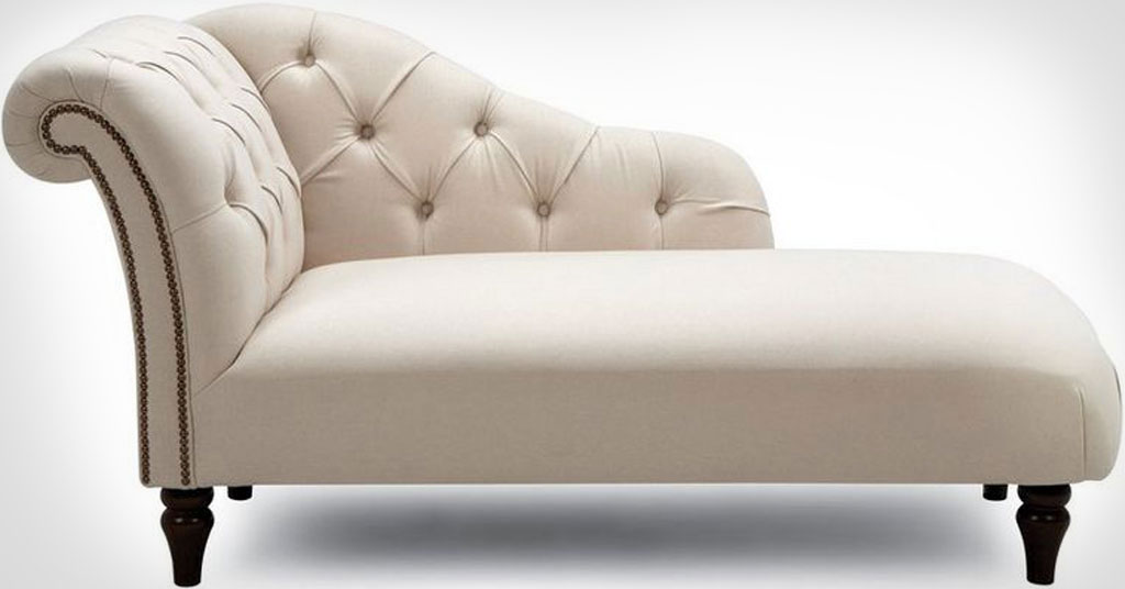 (Image Source: https://www.dfs.ie/cambourne/cmbe1erne)
We list below a few principles or guidelines that one may follow to apply maths to the designing of a space:
Rational and optimum use of space is what differentiates a good design from bad. The rule of three says that in a perfectly proportioned space, the larger of two items would be almost two thirds more than the smaller one. Talking about the interiors of, say, a house, if we divide a space into two sections, the larger one occupies two thirds of the space and can house the main furniture while the remaining third would account for a secondary function like a casual seating zone or storage. This is applicable for furniture items too- a sofa that is approximately 2:3 the length of the seating area and a centre table that is nearly 2/3rd the sofa length.
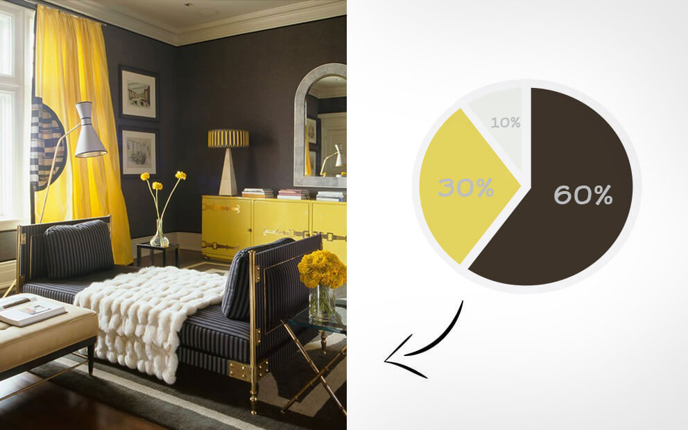 (Image Source: https://www.designtruffle.com/60-30-10-rule-help-choose-right-colors-space/)
This rule can be applied to determine the colour palette of a space. It involves the use of three colours-the dominant color covering around 60% of the space, mostly used in areas like walls and flooring, a secondary colour that takes 30% of the space and used for furniture and ultimately an accent color occupying 10% and is used in smaller décor items.
This concept can also be extended to the usage of three textures, three fabrics, three types of lighting etc. in the same 60-30-10 ratio to create balanced and visually pleasing interiors.
Latest research has also found a connection of colours with the Fibonacci sequence. Those separated by a ratio of 1:1.61 on the light spectrum are found to be aesthetically pleasing together.
The rule of thirds, commonly used in photography, is another mathematical concept that may be applied to create aesthetic design. It helps to place elements in a way that controls where a viewer’s eyes will travel. If we imagine a grid with two lines dividing it into equal thirds horizontally and vertically, making nine equal-sized squares, the middle of the center square would be the focal point. Here, a single large artwork may be placed and compositional elements may be placed along the grid lines or their intersections. Placing wall elements using this rule creates a more dynamic design that keeps the observer’s focus riveted, while adding depth and visual interest to a space.
Although symmetry plays a big role in design, too much of it imparts monotony and staleness. Most would agree that an odd number of items looks more natural and creates a hierarchy as compared to an even-numbered grouping. Odd numbers show progression and are dynamic - one needs to however balance the symmetry and asymmetry of a space.
In conclusion, all these ‘rules’ or principles are relevant for one reason only, and that is to create something dazzling, unique, pleasing and orderly all at the same time. Whether we use math to incorporate these qualities or an inherent sense of design based on the Fibonacci sequence of spacing, sizing and proportions, should be an individualistic choice.
Disclaimer : This blog is for informational purposes only and we have relied upon various resources for compiling the content, data and visuals contained in it.