We have spoken at length in our previous blogs on the relevance of graphics in contemporary interior design , and even traced the roots and evolution of graphics down the ages. However, all this talk would be meaningless and just for the archives if we did not actually use it in a practical way. As a leading interior design firm in India, Synergy has the onus to keep abreast of the latest trends in all aspects of design, be it functionality, aesthetics or work ethics. Being a design and build turnkey firm, we have the unique capability of delving deep into any project , big or small, and seeing it in a 360 degree view. We have used graphics as an integral part of our design approach since before the time they became a trend. You could say that ‘We practice what we preach!’
We as designers visualize concepts and data on behalf of our clients and shape dynamic, bespoke experiences that engage users and visitors at various levels. From establishing brand identity, improving employee morale, retention and participation, unifying company culture to creating a physical and sensory relationship with the users and imparting a unique ambience to a particular space, we create environments that communicate through ‘Experiential graphic design’.
A single project might have different types of graphics, depending on the zone and the mood one is trying to establish, while maintaining a uniformity and parity across the whole office. We would like to take you through some of our projects which we have classified according to the qualities or character that the graphics add to them.
For corporate interior design, showcasing the company culture is imperative to invoke trust and reliability in their target audience. Graphics in interior design is a powerful communicator, a visual representation of the "personality" of your brand in terms of core values, mission and philosophy to not just your clients but to your employees, associates and visitors.
Corporate colours are also almost sacrosanct for a company. Use of these, interwoven in design, is another way to establish brand consistency across all marketing platforms as well as to differentiate one’s business and stand apart from the competition.
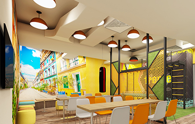
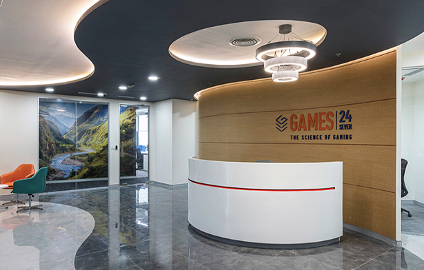
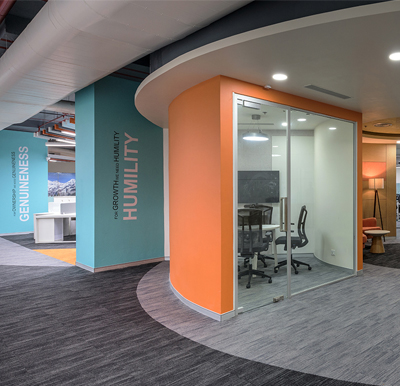 Games 24x7
 Games 24x7
For Games 24x7 in Mumbai, their core values are their ‘pillars’ and quite literally so! We have taken each value and through bold textual decals, displayed it on the bulky columns against a bright aqua paint (which is one of the corporate colours). This has not just added value and definition to the work zones around those columns but has helped to identify and locate a space within the large open office by virtue of their unique names. The use of corporate colours of aqua, teal and orange along with messages and images that illustrate the vision of the company further anchor the brand identity.
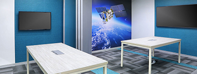
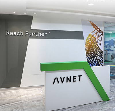 Avnet India
 Avnet India
The office of Avnet India - a leading distributor of semiconductors, passive, connectors and electro-mechanical components - has been designed keeping in mind its core values and brand relevance.The graphics here have been woven into the design right from inception. Notice how the diagonal lines in the reception desk, back wall and the graphic support each other. The picture of the satellite in the conference room again displays one of the various technologies that Avnet helps drive. The unique shade of green is a corporate colour that adds coherence and a sense of connectivity.
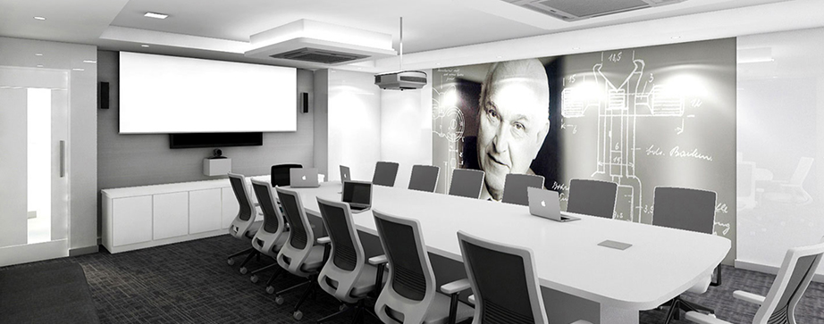 Karl Storz
 ITC Banglore
The office for Karl Storz, a leading German endoscope manufacturer, is designed on a minimalist theme using the corporate colours of white, grey and blue. The conference room graphic - a photograph of the founder along with the Single Line Diagram of their first product - is monochromatic and yet without the use of a single colour, adds power and a strong sense of identity and ownership to the conference room.
Another example of driving home the brand association is the ITC Banglore workstation hall. This being the food division zone, the columns bear the graphics of their food products.
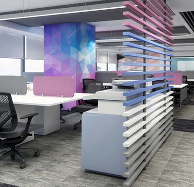
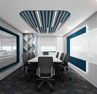
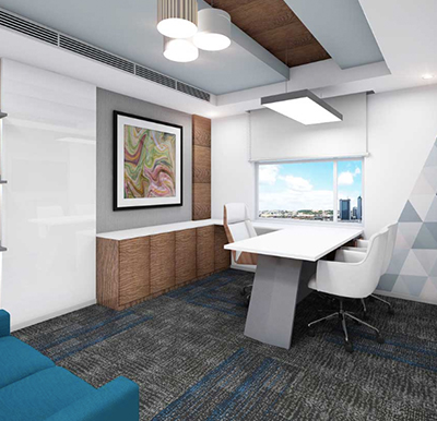
Another important function of experiential graphics is to set the mood or tone of a place. Corporate office design has various zones, each of which requires a different vibe. Conference or board rooms, for instance, mostly demand a formality and seriousness, while cafes and recreation areas would be informal and convivial. Workstations and collaborative spaces must invoke team spirit and focus while receptions would be warm and inviting. Therefore while designing and selecting graphics, we need to keep in mind the vibe that the company - as well as an individual zone within that office - is trying to project.
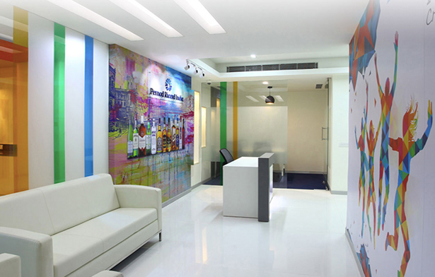 Pernod Ricard
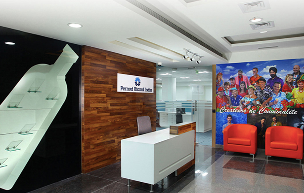 Pernod Ricard
Graphics have been optimally used in the interior design of the French multinational liquor company Pernod Ricard to depict the ‘spirit’ of the company.
30_july2021.png) Pernod Ricard Reception
Pernod Ricard Reception
Although the furniture and materials used are simple, the funky colourful graphics bursting forth with colour and energy infuse a joie de vivre in the reception areas aptly representing their motto ‘creators of conviviality’ and the company’s unique personality. The ‘people’ graphic in the image above is actually a photograph from their annual magazine featuring their employees from around the world. Design elements such as the kitsch barrel used as a coffee table, lend support to further enhance the mood of a space.
The cafe of Hathway is another example where a vibrant colourful graphic- a collage of pictures related to music in warm ochres and rusts - depicts an invigorating and convivial mood.
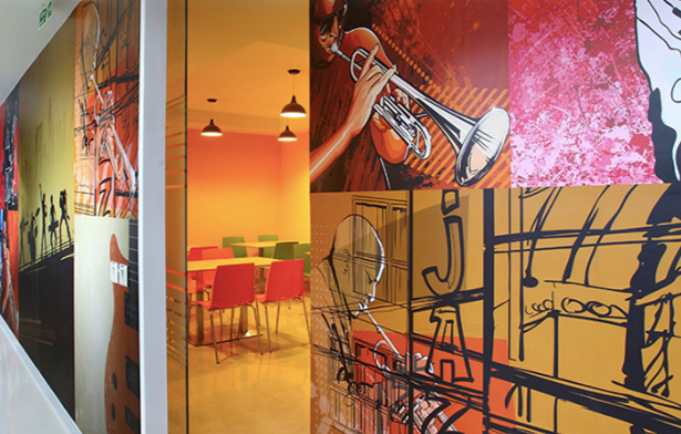 Hathway Cafe
 IILM cafe
Evoking a completely different vibe - an old world charm - is the IILM cafe. To break the monotony and redness of the existing brick walls, big frames in black were created directly on the walls, and black and white graphics depicting movement through music were showcased. The warm colours and wooden textures along with the graphics add a coziness and vintage element to the zone.
 cafe for Games 24x7
 Games room FF jaipur
 Futures First Hyderabad
Another mood that can be very nicely conveyed through graphics is that of entertainment, or even humour or levity. Take this cafe for Games 24x7 for instance, which has bright pops of colour in furniture and ceiling elements. The graphic on the curved wall was chosen as this black and white quirky one to provide the right balance, apart from creating an Instagrammable backdrop for employees, making them want to unwind and chill.
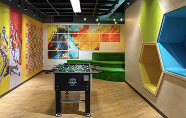
In the Futures First Jaipur cafe cum recreation room, bright abstracts and sporty graphics along with a Snakes and Ladder board lends an energy and fun vibe to this zone which houses the foosball table
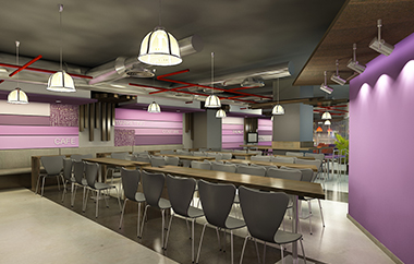
Not all graphics need to be vibrant, busy or funky. Sometimes it's a unique colour or a subtleness that is needed. At Futures First Hyderabad cafe, the soothing mauves and purples inevitably evoke a sense of relaxation. One would automatically feel refreshed and rejuvenated after a visit here.
Did we mention we love being quirky at times? We moved away from the boring standard look of a meeting room here and introduced a graphic on the ceiling that shows money falling from the sky - a take on the Futures First line of work (trading)-they are quite literally into the business of making money! The frosting on the glass showing binary digits, again points to the nature of the company.
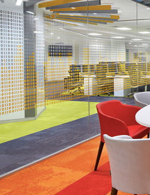 Frosting with binary digits
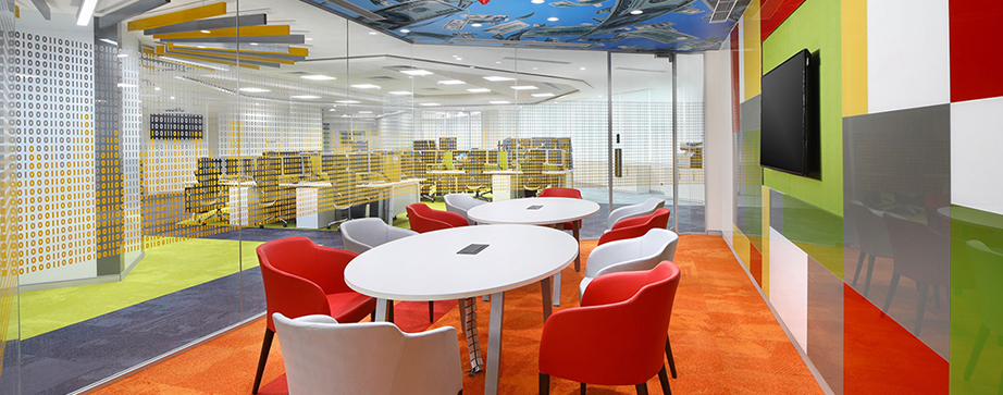 celling graphic
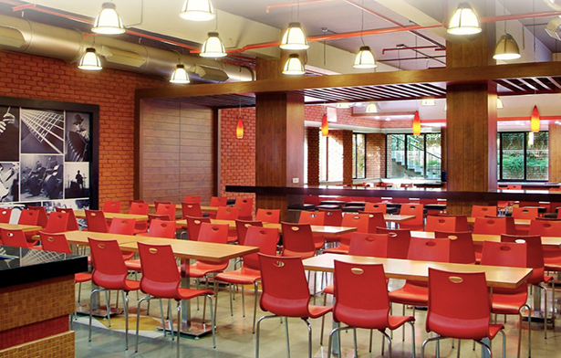
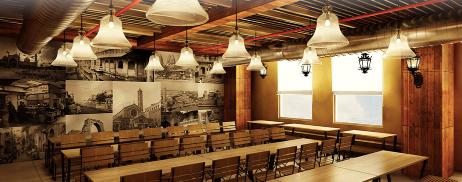 Bajaj Allianz Delhi
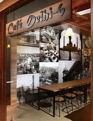 Bajaj Allianz Delhi
This themed cafe, although a part of the Bajaj Allianz Delhi office, stood out on its own . True to its name ‘Delhi 6’, each of the graphics, which is a black and white photograph, depicts landmarks of Old Delhi. Composed such that none loses its individual value and they all together read as a whole, this picture wall is what sets the mood and character of the cafeteria.
The theme is woven through the entire cafe in the choice of materials- ropes on the ceiling, rustic looking furniture and fittings, the lighting...and the graphic forming a focal background, transporting the user to the streets of Old Delhi.
We have noticed in our line of work that in a lot of corporate interior spaces, there is no access to views across the city or much natural light. This tends to slacken the morale and affects the productivity and efficiency of employees. Within the confines of such an office space, one feels isolated and there is no connection with the outside world. We at Synergy have proposed some cityscapes as graphics which have been hugely successful.
 Futures First Bangalore
30_july2021.png) ITC Jaipur
ITC Jaipur
The cafeteria cum recreation room at Futures First Bangalore uses a modern and vibrant colour palette.Since there is no natural light in this area, a wrap-around graphic showing a street view perspective is used on the L-shaped wall behind the seating, giving an illusion of eating in the outdoors, maybe in a street side cafe.
At ITC Jaipur, the colour palette is kept subtle. One wall graphic along with laser-cut jaali designs bring in the character of Jaipur to the interiors.
30_july2021.jpg) Futures First Kolkata
Futures First Kolkata
At Futures First Kolkata, the corridor is designed to make one feel as if one is walking down the city streets. Sketchy graphics with soft hues, also showing Saurav Ganguly swinging a bat, adds charm. The ceiling of this area is again unique- a back-lit sky with clouds and blossoming tree tops helps to bring the outdoors in.
At times the boundaries between the categories of classification blur or overlap and the graphics are used simply for aesthetics and to enhance the look of a place. For instance, at Games 24x7, serene landscapes have been used that not only tie the different elements of a zone together, but also provide an elegant and apt backdrop to the furniture.
 Games 24x7
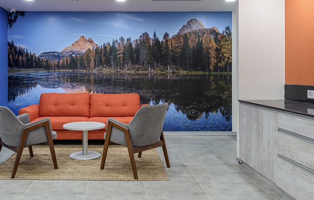 Games 24x7
At Stanford Labs, Gurgaon, picking the colour palette from the logo, abstract geometric graphics have been used to add vibrancy in the office.
 Stanford Labs, Gurgaon
 Stanford Labs, Gurgaon
 Stanford Labs, Gurgaon
At the recently completed project for M3M SmartWorld Gurgaon, in line with the premium interiors and finishes, the graphics too are classy and understated yet leave an impact and are inspirational. Each meeting room has a name corresponding to the photograph of a famous building displayed inside. The structure in the graphic further relates to what the company stands for - innovation, scale,speed and futuristic.
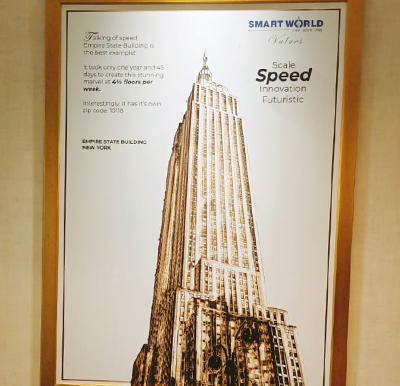 M3M SmartWorld Gurgaon
 M3M SmartWorld Gurgaon
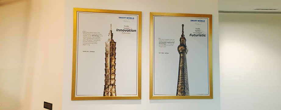 M3M SmartWorld Gurgaon
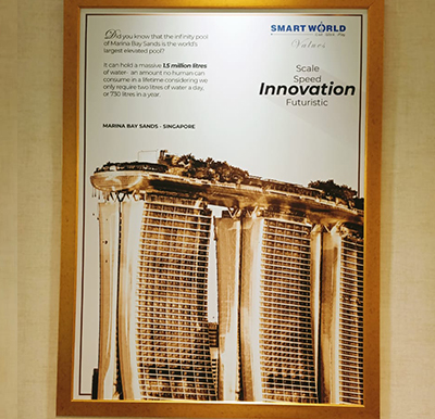 M3M SmartWorld Gurgaon
We could go on and on, but this is essentially the broad categorisation Synergy has worked with. Working with graphics means constantly being resourceful, thinking on your toes, following the client brief while unleashing your own creativity. Combining graphics is a layered process, where you would fix the frame first, and then add micro elements to it. From neutrals, to highlights of bright colours, from a mix of positive and negative spaces to creating thematic designs - it requires striking the right balance between focal points and soothing backgrounds.
Designing graphics is an ongoing, exciting and integral process of interior design. We hope you enjoyed this peek into the Synergy way of working and we look forward to sharing more interesting designs soon!